What’s big data? until not long ago, we looked at the abundance uf urban data as an enormous lists of numbers unconnected, difficult to manage or as an academic or research papers. But our way of seeing and understanding big data has changed, while we discover how some people, artists, researchers “geeks” use this urban data in order to create new ways of undesrtanding the society. The self-proclaimed “map geek” Eric Fischer is a pionner in interpreting big data in intriguing maps and spatial images that help us to understand the behaviour of the citizenship in the cities. And at the same time, he creates so beautifull images that he gets close to art. The pionner on mapping big data will attend to Technarte 2015 to talk about his work in Big Data and Art.
“Ultimately, almost everything I have been making tries to take the dim, distant glimpse of the real world that we can see through data and magnify some aspect of it in an attempt to understand something about the structure of cities,” he says. “I don’t know if that comes through at all in the actual products, but it is what they are all building toward.”
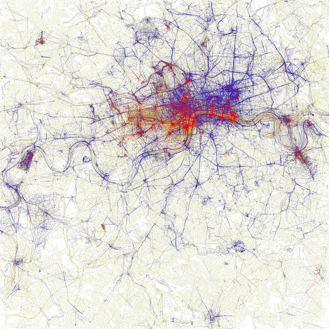
London. “Local and Tourists”. Eric Fischer
Eric is data artist and software developer at Mapbox. Before this, he was an artist in residence at the Exploratorium in San Francisco, and prior to that was a software engineer on the Android team at Google. His maps have been shown at the Museum of Modern Art and have been published in Wired, Popular Science, Best American Infographics, and many other print and online publications. He is particularly interested in using geographic data to understand and improve the pedestrian and transit experience in cities. He has a bachelor’s degree in Linguistics from the University of Chicago and lives in Oakland, CA.
Over the years Fischer has rendered loads of raw numbers into informative and visually powerful maps on a diverse range of topics: from race to language to the use of social media. The work is published in sets on Flickr (alongside an impressive collection of retro urban maps and street signs). His most popular set — “Locals and Tourists” — used geotagged photos from Flickr and Picasa to examine where visitors and natives take pictures in 124 cities.
“It’s a simple concept, but revealing about where the edges are where people turn back and stop exploring,” says Fischer.
“Locals and Tourists,” which was featured at MoMA’s “Talk to Me” exhibition in 2010, was actually derived from an earlier set called the “Geotaggers World Atlas.” The atlas ranks cities by the number of pictures taken in their central districts. While that system favored monocentric cities like New York and Paris, some of the best visuals come from polycentric places like Taipei.
“What I think this really established was that each city has a few streets, areas of shore, or scenic outlooks that are core to its identity, and you can tell which they are by the places that people take pictures of over and over again,” he says.
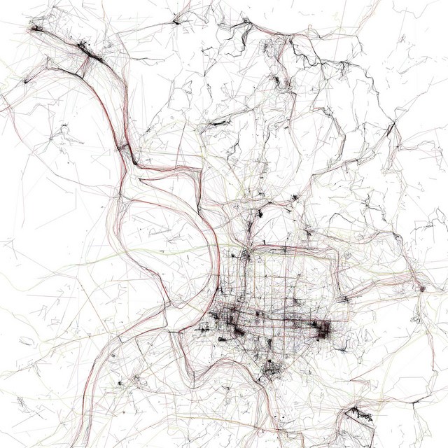
Taipei. “Geotaggers world atlas”. Eric Fischer
Another set that received considerable media attention — called “See something or say something” — compared where people post pictures to Flickr in various cities to where they tweet. As Fischer’s images show, most cities lean one way or the other. Berlin is very photo-heavy, for instance, especially placed beside a city like Jakarta, which is overrun by tweets. San Francisco has the healthiest mix, but that’s not too surprising, says Fischer, since both Flickr and Twitter are headquartered there.

San Francisco. “See something or say something”. Eric Fischer
One of Fischer’s latest sets is called “Paths through cities”. For each map Fischer routed 30,000 random trips based on 10,000 random geotags. Fischer says he’d hoped to figure out “what a subway network that tried to serve as many origins and destinations as possible, without taking into account other practical considerations, would look like“. The work is notable for its aesthetic as much as for its information: at a glance the stripped-down, black-and-white maps resemble cracks on a city sidewalk more than a city itself.
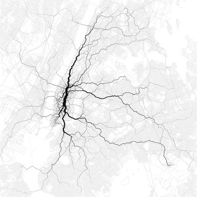
New York. “Paths through cities”. Eric Fischer
He once described himself as “pretty astounded” that his maps have received so much positive attention. He also thinks it’s the message trapped inside the data, and not necessary how he crafts it, that draws people to his work.
“When the maps succeed, I think it is when they can confirm something that the viewer already knows about their neighborhood or their city, and then broaden that knowledge a little by showing how some other places that the viewer doesn’t know so well are similar or different,” he says.
Eric Fischer is part of the programme of Technarte 2015, that will be held in Bilbao on 28th and 29th of May. As well as Eric Fischer, international speakers such as Lev Manovich, Gabriele Dine or Peter Shenai will talk about their projects related to Big Data and Art. ¡Don’t miss this opportunity and register now at Technarte 2015!.
All images courtesy of Eric Fischer.